Production
When filming the advert i had the equipment as follows:
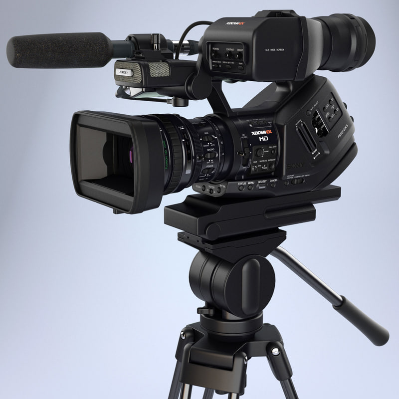
-Camera
-Camera legs/ stand
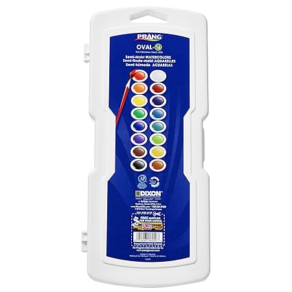
-Watercolours and paint brushes and the water
Destination:
For the filming destination i chose a plain table outside the media classrooms as the shot are close up so the table wouldn't be very visible anyway.
Crew:
For my crew i had my friends help film and get the shots while i painted, the friends who helped me were Darcey, Milli, Jasmine and with the artistry work my friend Faye helped me. One of my target for this project i was asked to try working with other people more and that is why i requested their help.
As for the filming there could have been some risks like:
* Getting water on the camera could get you electrocuted or break the camera
* Losing small parts like an SD card could be quite the problem
However with a product like mine there really isn't many risks that may occur with it
When filming i didn't really have a schedule because my main focus was to have enough footage that i could work with and that the shots were good enough to be in my advert, it had to be as much in focus as i could.
Also while filming i did it according to the storyboard which was:
1: big close up of me painting while the paint itself disperses across the page
2: a close up of the paintbrush swishing across the page and we see the paint disperse again
3: another close up of the paint mixing together
4: a close up shot of watercolour dripping down the page
5: a shot that slowly zooms into the logo of the prang watercolours
6: it then cuts to the case/ palette of the watercolours
7: at the end i intend of adding splatters of the paint on the case
however i did add more scenes to make sure there was more than needed so if the take wasn't good i would have backup scenes.
problems when recording or setting up:
with the production there were a few hiccups however it didn't affect the footage fully, people wondered across the set it wasn't in the frame it did distract us but it only delayed some parts but those parts could be cut out in editing.
we did also have trouble with putting the camera legs to the right length we needed for some shots and also the camera itself as my SD card is too big for the older camera's so we had to have a newer one.
my final edit of my 30 second advert:
For the video i used the song paradise by cold play the instrumental version and with the scenes i made it so that they go with the beat of the song.
as for making it i used a lot of close ups by either zooming in on premier pro or making close ups normally when filming.
for my print adverts i had a couple idea's that work together colour-wise and show the product and where to get it
this is first poster:

With this poster i got the background from the internet as well as the watercolour palette.
But with the palette i did have to manually remove the background as on Photoshop as when i used the magic wand tool it also removed the white of the palette so i used the eraser tool.
Finally with the text i decided to use the font Bradley hand ITC as i felt it could work well with the theme of the advert and appeal to people.
this is my second poster

With this poster i used the same picture from the first poster however i added the logo and drew a picture on Photoshop.
I brought in my drawing tablet from home and used it at college, it did take awhile to adjust to the new software as i am not used to drawing using Photoshop but i got the hang of it and i learned more about the program by doing so.
The font in the text was the same as the previous poster to keep the theme of the product and so that people see the link between the two posters.
my last poster:

With my posters i have tried to keep with the same colourful colour scheme and the same text font all the way through to link all of the posters together better.
for this poster i put a watercolour background and the same watercolour palette i use with the other posters do i used the same method with erasing the white background.
With this poster i added the text and the font is just like the other posters and i added watercolour flowers which matches the background.

for my posters i was planning of adding a silhouetted picture however i felt it would be better to actually have the paint as the main focus as it is the product after all.
 i did like the galaxy mixing of colours in this picture i painted so i wanted to add that in to my posters.
 i did like this picture so i did add it in my final edit of my advert to show what can be achieved using the watercolour paints.
-Camera
-Camera legs/ stand
-Watercolours and paint brushes and the water
Destination:
For the filming destination i chose a plain table outside the media classrooms as the shot are close up so the table wouldn't be very visible anyway.
Crew:
For my crew i had my friends help film and get the shots while i painted, the friends who helped me were Darcey, Milli, Jasmine and with the artistry work my friend Faye helped me. One of my target for this project i was asked to try working with other people more and that is why i requested their help.
As for the filming there could have been some risks like:
* Getting water on the camera could get you electrocuted or break the camera
* Losing small parts like an SD card could be quite the problem
However with a product like mine there really isn't many risks that may occur with it
When filming i didn't really have a schedule because my main focus was to have enough footage that i could work with and that the shots were good enough to be in my advert, it had to be as much in focus as i could.
Also while filming i did it according to the storyboard which was:
1: big close up of me painting while the paint itself disperses across the page
2: a close up of the paintbrush swishing across the page and we see the paint disperse again
3: another close up of the paint mixing together
4: a close up shot of watercolour dripping down the page
5: a shot that slowly zooms into the logo of the prang watercolours
6: it then cuts to the case/ palette of the watercolours
7: at the end i intend of adding splatters of the paint on the case
however i did add more scenes to make sure there was more than needed so if the take wasn't good i would have backup scenes.
problems when recording or setting up:
with the production there were a few hiccups however it didn't affect the footage fully, people wondered across the set it wasn't in the frame it did distract us but it only delayed some parts but those parts could be cut out in editing.
we did also have trouble with putting the camera legs to the right length we needed for some shots and also the camera itself as my SD card is too big for the older camera's so we had to have a newer one.
my final edit of my 30 second advert:
For the video i used the song paradise by cold play the instrumental version and with the scenes i made it so that they go with the beat of the song.
as for making it i used a lot of close ups by either zooming in on premier pro or making close ups normally when filming.
for my print adverts i had a couple idea's that work together colour-wise and show the product and where to get it
this is first poster:
With this poster i got the background from the internet as well as the watercolour palette.
But with the palette i did have to manually remove the background as on Photoshop as when i used the magic wand tool it also removed the white of the palette so i used the eraser tool.
Finally with the text i decided to use the font Bradley hand ITC as i felt it could work well with the theme of the advert and appeal to people.
this is my second poster

With this poster i used the same picture from the first poster however i added the logo and drew a picture on Photoshop.
I brought in my drawing tablet from home and used it at college, it did take awhile to adjust to the new software as i am not used to drawing using Photoshop but i got the hang of it and i learned more about the program by doing so.
The font in the text was the same as the previous poster to keep the theme of the product and so that people see the link between the two posters.
my last poster:

With my posters i have tried to keep with the same colourful colour scheme and the same text font all the way through to link all of the posters together better.
for this poster i put a watercolour background and the same watercolour palette i use with the other posters do i used the same method with erasing the white background.
With this poster i added the text and the font is just like the other posters and i added watercolour flowers which matches the background.

for my posters i was planning of adding a silhouetted picture however i felt it would be better to actually have the paint as the main focus as it is the product after all.
 i did like the galaxy mixing of colours in this picture i painted so i wanted to add that in to my posters.
Comments
Post a Comment